


The Tree Map chart is a new chart type available in Microsoft® Excel® 2016. It’s used to proportionally display hierarchical levels of data in the form of different sized rectangle blocks. A sales manager can use the Tree Map chart to monitor the performance of the sales consultants. This chart would be best suited to […]
- Solutions
All Solutions
- Standalone Reporting Tool
- Sage Intelligence for Accounting
- Sage 300cloud Intelligence
- Sage 50cloud Pastel Intelligence Reporting
- Sage Pastel Payroll Intelligence Reporting
- Sage 100/200 Evolution Intelligence Reporting
- Sage 100 Intelligence Reporting
- Sage 300 Intelligence Reporting
- Sage 500 Intelligence Reporting
- Sage VIP Intelligence Reporting
- Resources
All Solutions
- Standalone Reporting Tool
- Sage Intelligence for Accounting
- Sage 300cloud Intelligence
- Sage 50cloud Pastel Intelligence Reporting
- Sage Pastel Payroll Intelligence Reporting
- Sage 100/200 Evolution Intelligence Reporting
- Sage 100 Intelligence Reporting
- Sage 300 Intelligence Reporting
- Sage 500 Intelligence Reporting
- Sage VIP Intelligence Reporting
Additional Reports
Download our latest Report Utility tool, giving you the ability to access a library of continually updated reports. You don’t need to waste time manually importing new reports, they are automatically imported into the Report Manager module for you to start using.Sage Intelligence Tips & Tricks
Our Sage Intelligence Tips and Tricks will help you make the most of your favorite reporting solution.Excel Tips & Tricks
Our Excel Tips and Tricks will help you improve your business reporting knowledge and skills.Tips & Tricks
How to convert dates into the correct format in Excel
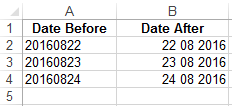
When extracting data from a database, dates don’t always show up in the format you want them to. That’s why it’s helpful to know how to use the Text to Columns option to convert dates into a format that can be used to easily analyze or work with data. As an accountant, you may want […]
How to create quarters in Excel
Currently, there’s no function that will convert dates into quarters in Microsoft® Excel®. However, using the CHOOSE function, we can easily convert dates into quarters in Excel. The CHOOSE function returns a value from a list of items based on a position number. For example, if we had a function =CHOOSE(3,”Apples”,”Bananas”,”Peaches”,”Pineapples”) the function would return […]
How to change the default font size for Excel comments
Adding a comment to a cell in Microsoft® Excel® is a quicker way of providing feedback. Instead of typing out an email to provide feedback, you can simply enter important information straight into the spreadsheet. However, you may want to change the default font size for Excel comments because it’s currently too small for you […]
How to quickly rearrange columns in a data table in Excel
As with most commands in Microsoft® Excel®, there’s an easy way and a long way to rearrange columns in a data table. The long way would be to highlight a column, cut it, and then paste it where you want to move it to. In this tip, I’m going to show you the easy and […]
Learn how to categorize debtors balances in Excel using icon sets
As an accountant, you can easily categorize debtors balances by using the conditional formatting – icon sets option. Icon sets creates a visual effect in your data and helps you to see how the value of a cell compares to other cells. In the example below we categorize the debtors balances as follows: red icon […]
5 Easy steps to enhance your dashboards in Excel using the camera tool
The camera tool enables you to take a picture of a range of cells and display it in a preferred way, thus allowing you to enhance your dashboards. The picture will automatically update when the data in the original cells change. In this example, the column Sparkline chart will be rotated to create a bar chart enabling […]
Using a bar chart in Excel to display YTD receipts and payments
Using the correct medium to display your financial results is important. As an accountant, you may want to display the YTD receipts and payments on a chart. For example, selecting a pie chart will not be useful as too many values will be displayed; making your data visualization difficult to interpret. In this week’s tip […]
5 Easy steps using Data Validation for dates in Excel
When you are working on a project timeline in Microsoft® Excel®, the end date should always be greater than the start date; however, errors can occur when entering dates manually onto a spreadsheet. By applying Excel’s Date Data Validation you can ensure that the project end date will always be greater than the start date. […]
5 Easy steps using the combination chart in Excel to help you monitor budgets
There are many different charts in Microsoft® Excel®, but only one that allows you to highlight different types of information by combining two or more chart types into one. The combination chart can be used to see how far away a value is from the target or if it is over the target. In this […]
 © Sage South Africa Pty Ltd 2020
.
All Rights Reserved.
© Sage South Africa Pty Ltd 2020
.
All Rights Reserved.