The camera tool enables you to take a picture of a range of cells and display it in a preferred way, thus allowing you to enhance your dashboards. The picture will automatically update when the data in the original cells change.
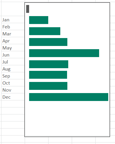
In this example, the column Sparkline chart will be rotated to create a bar chart enabling us to better analyze the YTD variance between budgets and actuals. There is no standard Sparkline bar chart, but that can easily be created by using the camera tool after rotating the object.
You are welcome to download the workbook to practice.
Applies To: Microsoft® Excel® 2010, 2013 and 2016.
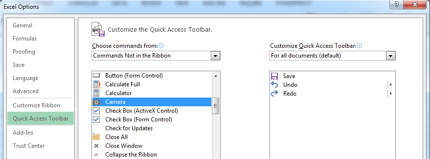
1. We start by adding the Camera tool to the quick access tool bar because it is not available on the ribbon.
- Select the File Tab, then select
- Select the Quick Access Toolbar.
- In the Choose Commands From drop-down menu, select Commands Not in the Ribbon.
- Scroll down the list of commands and find Camera.
- Select Add, and then select
2. Select the Data worksheet then click on the column Sparkline chart.
3. From the Quick Access Toolbar select the Camera tool.
4. Paste the picture by clicking next to the month labels on the worksheet.
5. Select the rotate button and rotate the picture clockwise to align with a cell border.
6. Select crop from the Size group and crop the picture to remove the white spaces around the picture.
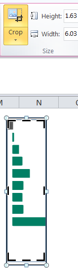
By rotating the column Sparkline you are able to easily create a bar chart that is not available on the Sparkline group. Creating a bar Sparkline will involve a lot of intricate steps and take time. That is why the camera tool is useful, because all you have to do is rotate the object and as a result, you save time in the process.
