Using the correct medium to display your financial results is important. As an accountant, you may want to display the YTD receipts and payments on a chart. For example, selecting a pie chart will not be useful as too many values will be displayed; making your data visualization difficult to interpret.
In this week’s tip we’ll show you how to apply the bar chart instead. This will help you better present your YTD receipts and payments by displaying many values simultaneously, making the visual representation of your data clearer.
You are welcome to download the workbook to practice.
Applies To: Microsoft® Excel® 2010, 2013 and 2016.
1. Chart: Select the data range B3:G9 on the Bar worksheet, then the Insert tab and bar chart under the Charts group.

2. Reverse Category Order: Double click/right-click the vertical axis then select Format Axis , Axis Options and check the box for Categories in reverse order.
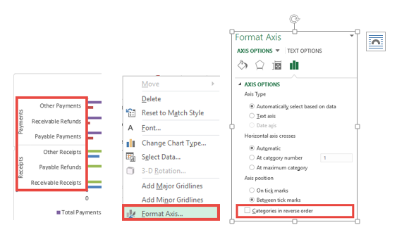
This will sort the data in the same order as the source data –
3. Set Overlap and Gap Width: Edit the series; right-click/double click one of the bars to open the Format Data Series dialog box then select Series Options and set series overlap to 100% and the Gap Width to 0%.

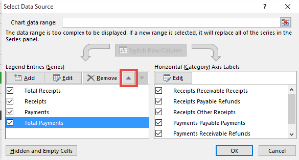
4. Rearrange series order: Right-click the chart then select Select Data.
Rearrange the series using the up/down arrows so that the “Total Receipts” and “Total Payments” series are at the top of the list and select OK.
5. Format colors: With the bars in the chart selected add definition to them with a white outline (Format tab then Shape Outline), and set your colors for the bars (Format tab then Shape Fill):

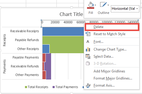
6. Labels: If you are going to add Labels to the bars, then delete the horizontal axis labels otherwise, you will be duplicating the information. To delete the labels, right click on the horizontal axis then select Delete.
7. To add labels to the bars, right click on each bar then Add labels. The additional labels for the “Total” series will need to be deleted.

The label can be edited to add a title and then aligned as required.
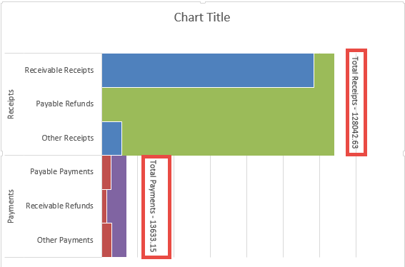
8. Label and format the chart accordingly.
By creating this bar chart, you are able to display the data in a more meaningful and easy to understand manner. The audience will not struggle to understand the information during presentations.

