
There are many different charts in Microsoft® Excel®, but only one that allows you to highlight different types of information by combining two or more chart types into one. The combination chart can be used to see how far away a value is from the target or if it is over the target.
In this week’s tip we’ll take a look at the following example, an accountant can set a budget and by using the combination chat, to determine if the actual is over or under budget. The line chart will represent the budget and the columns will display the actual values.
You are welcome to download the workbook to practice.
Applies To: Microsoft® Excel® 2010, 2013 and 2016.
- Select the data range A1:C5.
- Select the Insert tab, then Recommended Charts under the charts group.
- Select the All Charts tab, then Combo from the list and click OK.
- To create a dynamic title, click on the chart title place holder.
- Place the cursor in the formula bar and type =, then click in cell B1 and press Enter.
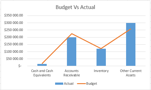
The combination chart makes it easy to monitor your budget, helping you get a snapshot of your financial data so that you can bring your expenses under control. With this snapshot view, decisions can be made quickly thus saving you time.
