The Tree Map chart is a new chart type available in Microsoft® Excel® 2016. It’s used to proportionally display hierarchical levels of data in the form of different sized rectangle blocks. A sales manager can use the Tree Map chart to monitor the performance of the sales consultants.
This chart would be best suited to data that is based on categories of some kind. In this tip, we explain how to create a Tree Map chart from Item categories sold by sales consultants. Tree Map charts can only be created off of a data table, and not PivotTables.
You are welcome to download the workbook to practice.
Applies To: Microsoft® Excel® 2016.
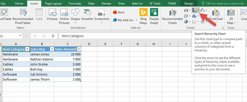
1.Select the data table.
2. Select the Insert tab, then the Tree Map chart icon.
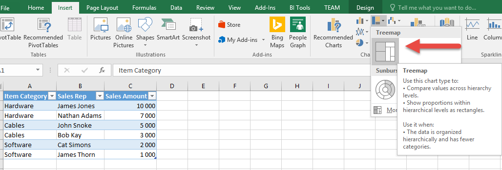
3. Click on the Tree Map chart type.
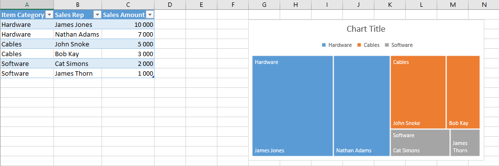
Your Tree Map chart will be automatically created. You will notice that each block represents a different colour for each item category, and a different size for each sales consultant. The size of the block is determined by the sales amount.
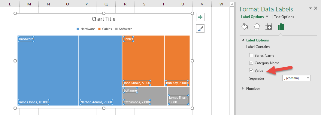
You can format your data labels by right clicking on them, and then selecting the “Format Data Labels” option.
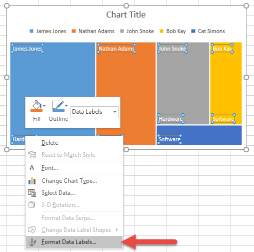
Click on the value checkbox and you will notice that the sales values now appear next to the sales consultant.
By creating a Tree Map chart, the performance of the sales consultants can be easily monitored. As a result, time will be saved, leading to increased productivity.
