In our last tip, we looked at the functionality of the different icons provided on the Report Manager menu ribbon. You can find this tip here. Now, we’re going to do the same for the Connector module. Take note that icons will activate / deactivate based on your selection in the object window. These icons are […]
- Solutions
All Solutions
- Standalone Reporting Tool
- Sage Intelligence for Accounting
- Sage 300cloud Intelligence
- Sage 50cloud Pastel Intelligence Reporting
- Sage Pastel Payroll Intelligence Reporting
- Sage 100/200 Evolution Intelligence Reporting
- Sage 100 Intelligence Reporting
- Sage 300 Intelligence Reporting
- Sage 500 Intelligence Reporting
- Sage VIP Intelligence Reporting
- Resources
All Solutions
- Standalone Reporting Tool
- Sage Intelligence for Accounting
- Sage 300cloud Intelligence
- Sage 50cloud Pastel Intelligence Reporting
- Sage Pastel Payroll Intelligence Reporting
- Sage 100/200 Evolution Intelligence Reporting
- Sage 100 Intelligence Reporting
- Sage 300 Intelligence Reporting
- Sage 500 Intelligence Reporting
- Sage VIP Intelligence Reporting
Additional Reports
Download our latest Report Utility tool, giving you the ability to access a library of continually updated reports. You don’t need to waste time manually importing new reports, they are automatically imported into the Report Manager module for you to start using.Sage Intelligence Tips & Tricks
Our Sage Intelligence Tips and Tricks will help you make the most of your favorite reporting solution.Excel Tips & Tricks
Our Excel Tips and Tricks will help you improve your business reporting knowledge and skills.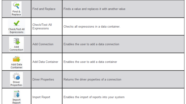
Get a dynamic view of your top customers with the Top Customers Analysis report
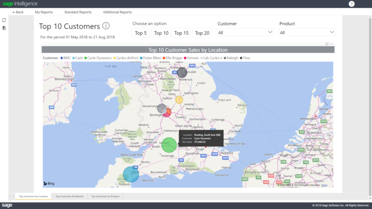
This report gives you a dynamic view of your top 5, 10, 15 and 20 customers—depending on your requirements. The first dashboard you’ll notice is a map chart, which opens up after you’ve entered your required from and to date. This map chart highlights the amount of Sales per Customer by Location. The size of the bubble indicates the […]
View quantities and values of stock purchased and sold with the Stock Movement report

This report displays the quantities and values of stock purchased and sold from the start date you enter at runtime to the current date, broken down by product. It also includes opening and closing stock amounts. This enables you to tell, at a glance, whether you’re perhaps overstocking or understocking on certain items, and whether […]
Get an overview of your purchasing behaviour with the Purchase Analysis report
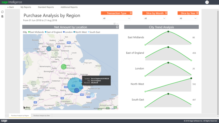
This report gives you an overview of where, and from whom, you’re purchasing goods and services based on the date selection you have made. To run this report, you’ll first choose the from and to date by simply clicking on the date selector to expand it further: The Purchase Analysis by Region report will then open for the period […]
Flag customers who owe you money with the Overdue Customers report

This report helps you flag customers who are currently overdue and owe you money. With this report, you’ll be able to drill-down to specific customer information to follow up on the outstanding amounts as soon as possible—which will help your business cash flow. There are 3 pages to this report, namely; Overdue Customer Dashboard, Detail, […]
How to create a linked dashboard (or landing page) for your Excel workbook

Have you ever had the pleasure (or displeasure) of working with an extra large Excel workbook with many, many different sheets? This happens frequently, especially if you are working with a large amount of data that needs to be analyzed periodically. This may be due to multiple tables, lookups, references, charts, graphs etc. This has […]
Learn how to use Column Variables for more descriptive headings in your cloud reports

Having descriptive headings in a report can make it easier to comprehend. For example, having month names instead of period values for column titles can make it easier to determine the data a column refers to. Sage Intelligence now makes this possible in a dynamic way through Column Variables. This tip applies to: Sage Business […]
Learn how to check your Containers in the Sage Intelligence Connector module
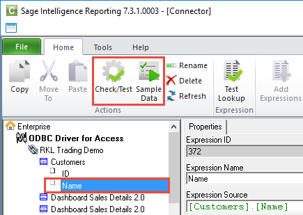
Being able to check if the components of a report are functioning as expected while working with them can help provide a smooth workflow and save time dealing with problems later in the report creation process. Also, if you do come across errors in a report, being able to test its components easily allows for […]
Five non-negotiable questions you should be asking your reporting solution

Many companies today suffer from a lack of visibility into key performance metrics. We call this “keyhole visibility” because it’s the equivalent of trying to evaluate what’s happening in a room by looking through the keyhole. With a narrow view, you’re unable to fully understand what’s behind the door and what might be lurking around […]
Dashboards: All your vital information in one place

A dashboard is a business tool that displays a set of metrics, KPIs and other relevant information to a business user. Dashboards are here to stay because of their simplicity and self-service capabilities. And recently, Microsoft has made dashboards even more relevant, visual and efficient to use through Power BI. Haven’t heard of it? Here’s […]
 © Sage South Africa Pty Ltd 2020
.
All Rights Reserved.
© Sage South Africa Pty Ltd 2020
.
All Rights Reserved.