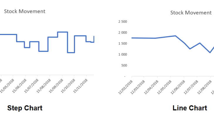
A step chart shows changes that occur over irregular intervals. For example, it can show stock movement changes, interest rates, etc. A step chart is the perfect alternative to a line chart as it displays the trend as well as the time taken between changes. The difference between a Step Chart and Line Chart: A line […]
- Solutions
All Solutions
- Standalone Reporting Tool
- Sage Intelligence for Accounting
- Sage 300cloud Intelligence
- Sage 50cloud Pastel Intelligence Reporting
- Sage Pastel Payroll Intelligence Reporting
- Sage 100/200 Evolution Intelligence Reporting
- Sage 100 Intelligence Reporting
- Sage 300 Intelligence Reporting
- Sage 500 Intelligence Reporting
- Sage VIP Intelligence Reporting
- Resources
All Solutions
- Standalone Reporting Tool
- Sage Intelligence for Accounting
- Sage 300cloud Intelligence
- Sage 50cloud Pastel Intelligence Reporting
- Sage Pastel Payroll Intelligence Reporting
- Sage 100/200 Evolution Intelligence Reporting
- Sage 100 Intelligence Reporting
- Sage 300 Intelligence Reporting
- Sage 500 Intelligence Reporting
- Sage VIP Intelligence Reporting
Additional Reports
Download our latest Report Utility tool, giving you the ability to access a library of continually updated reports. You don’t need to waste time manually importing new reports, they are automatically imported into the Report Manager module for you to start using.Sage Intelligence Tips & Tricks
Our Sage Intelligence Tips and Tricks will help you make the most of your favorite reporting solution.Excel Tips & Tricks
Our Excel Tips and Tricks will help you improve your business reporting knowledge and skills.- Learning
- Support
All Solutions
- Standalone Reporting Tool
- Sage Intelligence for Accounting
- Sage 300cloud Intelligence
- Sage 50cloud Pastel Intelligence Reporting
- Sage Pastel Payroll Intelligence Reporting
- Sage 100/200 Evolution Intelligence Reporting
- Sage 100 Intelligence Reporting
- Sage 300 Intelligence Reporting
- Sage 500 Intelligence Reporting
- Sage VIP Intelligence Reporting
Additional Reports
Download our latest Report Utility tool, giving you the ability to access a library of continually updated reports. You don’t need to waste time manually importing new reports, they are automatically imported into the Report Manager module for you to start using.Sage Intelligence Tips & Tricks
Our Sage Intelligence Tips and Tricks will help you make the most of your favorite reporting solution.Excel Tips & Tricks
Our Excel Tips and Tricks will help you improve your business reporting knowledge and skills.Get Support Assistance
Can’t find the solution to the challenge you’re facing in the resource library? No problem! Our highly-trained support team are here to help you out.Knowledgebase
Did you know that you also have access to the same knowledgebase articles our colleagues use here at Sage Intelligence? Available 24/7, the Sage Intelligence Knowledgebase gives you access to articles written and updated by Sage support analysts.Report Writers
Having some trouble creating or customizing the exact report you need to suit your business’s requirements? Contact one of the expert report writers recommended by Sage Intelligence.- Sage City
- University
- About Us
- Contact Us
Home Excel Charts
5 Easy steps using the combination chart in Excel to help you monitor budgets
There are many different charts in Microsoft® Excel®, but only one that allows you to highlight different types of information by combining two or more chart types into one. The combination chart can be used to see how far away a value is from the target or if it is over the target. In this […]
Get creative in Excel using sparklines to show data trends
New in Microsoft® Excel® 2010, and later versions, a sparkline is a tiny chart in a worksheet cell that provides a visual representation of data. Use sparklines to show trends in a series of values, such as seasonal increases or decreases, economic cycles, or to highlight maximum and minimum values. For more impact, a sparkline […]
An easy way to create a dual chart in Excel, trending with a secondary axis
Charts by default display a primary vertical axis when created. This works if there is only one unit of measure in the data. However, should there be different units of measure in your data, a secondary axis will be required, thus allowing you to create a dual chart in your Microsoft® Excel® workbook. In our […]
How to create an Excel combination chart from scratch
After you have created your Microsoft® Excel® spreadsheet, you can visually represent the worksheet data by creating a chart. Charts often make your data clearer and easier to understand. If you find that the data is not in sequence or in a group of cells, you may need to create your own series, specifying the […]
Return to topLearning
Sage South Africa© Sage South Africa Pty Ltd 2020 . All Rights Reserved.