After you have created your Microsoft® Excel® spreadsheet, you can visually represent the worksheet data by creating a chart. Charts often make your data clearer and easier to understand.
If you find that the data is not in sequence or in a group of cells, you may need to create your own series, specifying the labels and values. Data can be extracted from different worksheets and even workbooks.
TIP: To create a quick chart, select any cell within the data range and press F11.
In this tip, we are going to create a combination chart from scratch showing the difference between the Sales and Purchases.
Note: Download the workbook to practice
Applies To: Microsoft® Excel® 2007,2010 and 2013
- Open the practice workbook.
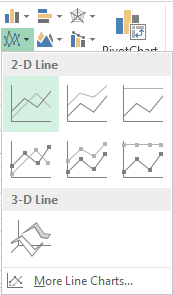
- Create a blank line chart:
a. Select any blank cell on the worksheet.
b. From the Insert tab, in the Charts group, select Line.
c. Select 2-D Line.
3. Add data to the chart:
a. Select the blank chart.
b. From the Design tab, in the Data group, select Select Data.
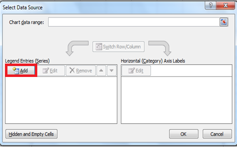
- To create the Sales series:
a. Select the Add button in the Legend Entries (Series)
i. Click in the Series name text box and select cell A4(Series name).
ii. To highlight the data range, click in the Series values text box.
iii. Clear the contents and select the range C5:C16.b. The Edit Series box should contain the following:
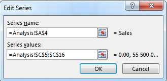
c. Select OK.
- To create the Purchases series:
a. Select Add.
i. Click in the Series name text box and select cell A21(Series name).
ii. To highlight the data range, click in the Series values text box.
iii. Clear the contents and select the range C22:C33.b. The Edit Series box should contain the following:
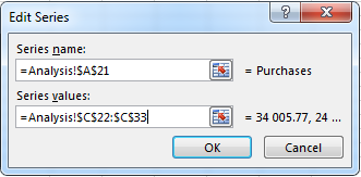
c. Select OK.
- Select the Edit button in the Horizontal (Category) Axis Labels.
a. To display the months on the horizontal line, highlight the data range A5:A16 or A22:A33.
b. Select OK.
7. Add a chart title:
a. Select the chart as below.
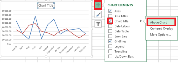
b. Enter the heading as Sales Vs Purchases.
8. Move the chart to a new worksheet:
a. From the Design tab, in the Location group, select Move Chart.
b. Select New Sheet and name the worksheet as shown below.
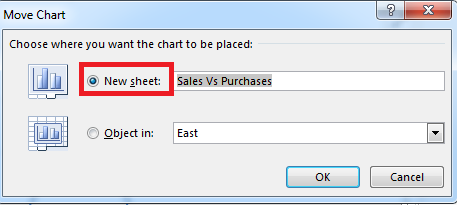
c. Select OK.
9. Right click on the Sales series.
10. Select change series chart type.
11. Select the down arrow under chart type at the bottom of the window.
12. Select Clustered column and select OK.
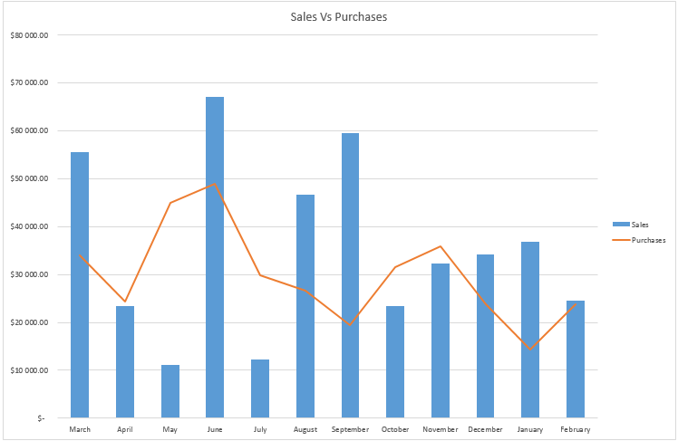
You can place charts in different worksheets to make it easier for you to analyse your information. The chart that we have created compares Purchases to Sales, which can quickly help you with decision making.
