New in Microsoft® Excel® 2010, and later versions, a sparkline is a tiny chart in a worksheet cell that provides a visual representation of data. Use sparklines to show trends in a series of values, such as seasonal increases or decreases, economic cycles, or to highlight maximum and minimum values. For more impact, a sparkline should always be positioned near its data. Whilst this is not a PivotTable option, it is a great tool to use along with PivotTables.
In our example, we’ll display the monthly data trends for the different branches using a sparkline.
Applies To: Microsoft® Excel® 2010 and 2013.
Note: You are welcome to download the workbook to practice.
- Select cell O5 on the sparklines worksheet.
- Now select the Insert tab then line under the sparklines group.
- Select the data range B5:M5, then select OK.
- Right click on column O and adjust the column width to 30, then copy the sparkline to cell O8.
- Highlight rows 5:8 and right click on one of the selected rows and change the row height to 60.
- Select one of the sparklines under design tab select markers.
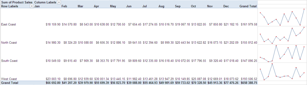
You have now created a visual representation of your data. It will be easy to analyze your monthly data using sparklines, helping you identify trends on the spot.
