Charts by default display a primary vertical axis when created. This works if there is only one unit of measure in the data. However, should there be different units of measure in your data, a secondary axis will be required, thus allowing you to create a dual chart in your Microsoft® Excel® workbook.
In our practice exercise we are going to display the sales target and actual data on the primary axis as values, and the variance as a percentage on the secondary axis.
Note: You are welcome to download the workbook to practice.
Applies To: Microsoft® Excel® 2007, 2010 and 2013.
1. Select the entire data range (A2:D14) then press F11 to create a quick chart.
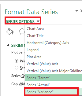
2. Right click on one of the series on the chart, and select format data series.
3. Then under series options, select series variance.
4. Right click on one of the variance series on the chart.
![]()
5. Select Format Data Series, then select Secondary Axis.

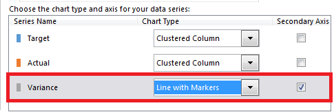
6. Right click on one of the variance series and select Change Series Chart Type.
7. Select line with markers under chart type for variance.
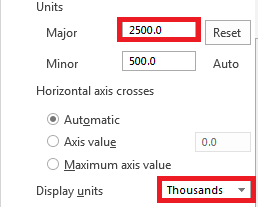
8. Select OK, now right click on the Primary axis and select Format Axis.
9. Enter 2500 under major units and select thousands next to Display units.
10. Add a suitable chart title.
11. Right click one of the horizontal grid lines and select delete.
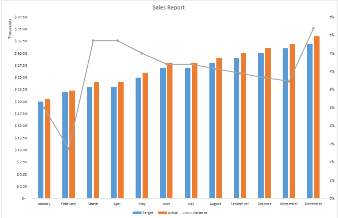
The primary axis displays the target and actual data. As you can see, a secondary axis that displays the variance in percentages has been added, thus showing you a trend.
