Did you know that you can create a thermometer chart in Microsoft® Excel®? You can use the thermometer chart to compare your performance against a set goal. For example, revenue vs target or budget vs actual, can be plotted using a thermometer chart.
The performance value and its corresponding target are stacked on top of one another. This looks similar to mercury rising in a thermometer, hence the term thermometer chart.
In this week’s tip, we’re going to create a chart that displays the budget vs actual for the net profit in our example exercise.
Note: You are welcome to download the workbook to practice.
Applies To: Microsoft® Excel® 2007, 2010 and 2013.
1. Open the practice workbook and highlight the data range A2:C14..
2. Select the Insert tab, then under the Charts group click on the Column chart icon.
3. Select the Stacked Column chart.
4. Right click the Actual data series and select Format Data Series.
5. In the Format Data Series dialog box, select the Secondary Axis option.

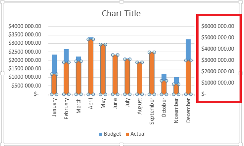
6. Delete the new vertical axis added to the right of the chart.
7. Right click the Budget series and select Format Data Series.
8. Adjust the gap width to about 50% ,so that the Budget series is slightly wider than the Actual series.

9. Place the cursor in the title text box and enter: Net Profit – Actual vs Budget.
10. Right click on the vertical axis and select Format Axis.
11. Select the drop down arrow next to Display units and select Millions.

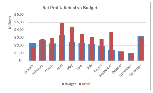
The chart appropriately displays the Budget vs Actual results. If the actual is over budget, it will overlap the budget series. By using the thermometer chart, it becomes easier to show the performance (Actual) compared against the set goal (Budget).
