If you’re looking for better insight into your business’s financial performance, then creating an interactive dashboard might be the answer. By using a dashboard, you can quickly and easily recognize trends, do comparisons and review performance indicators that will lead to informed decision making.
This week, we’ll take you through a few easy steps to help you create your own interactive financial dashboard. In the dashboard, we present data using:
- Waterfall charts
- Bullet charts
- Slicers
- Sparklines
- Conditional formatting
- Form controls such as check boxes and option buttons
Follow the steps below to create your own Financial Dashboard.
You are welcome to download the dashboard template to practice. Remember, you’ll need to replace this data with your own data, and add the relevant periods, in order for it to work for your business needs.
Applies To: Microsoft Excel 2010 and 2013.
1. In order to view data for various months, drag the vertical scroll bar in cells Q2 to Q4.
![]()
2. To view the Net Profit Trend for a specific year, select the appropriate check box.

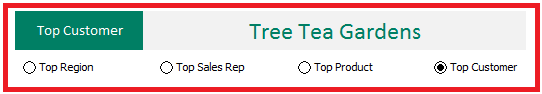
3. Should you want to analyse the sales for a region, select the respective button.

If you want to analyze sales by Category Sales, Quantities Sold and Sales Rep Trends, select the appropriate button.

Select the relevant option button , to analyze sales by various categories.
The dashboard is interactive and a time saving tool. It assists in making quick business decisions and provides an overall view of the financial status of the business.
