In this tip, you’ll discover how to use Sparklines to analyze your cash flow data. First introduced in Microsoft® Excel® 2010, Sparklines are small charts that fit into a single cell in a worksheet. We’ll show you how to use them to get a quick look at trends or changes in your data that may not be easily spotted, and how to represent negative values so that patterns can be easily identified.
You are welcome to download the workbook to practice this exercise
Applies To: Microsoft Excel 2010 and 2013
1. Open the exercise workbook. You will see a part of a Cash Flow Statement report.
2. Select cell Q14.
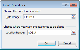
3. Select the Insert Tab, then Column under the Sparklines
4. Select the data range E14:P14.
5. Select OK.
6. Extend the width of column Q to 30.
7. Copy the Sparkline to row 27.
8. Highlight rows 14 to 27.
9. Right-click on one of the selected row numbers.
10. Select Row Height.
11. Enter 40.
12. Select OK.
13. Click on one of the Sparklines.
14. Select the Design Tab.
15. Select Marker Color.
16. Select Negative Points.
17. Select Red.
Each period is represented by a bar in the chart so that you can easily spot the trends. Negative values are also easy to spot since they’re in red.


