This tip applies to Accounting International, Microsoft Excel 2013 and 2016.
Do you want to create your own reports and analyze them according to your specific reporting needs? Yes you do! Now you can, with Sage Intelligence Reporting and Microsoft® Excel®. Not only is it quick and easy, but it also makes your business reporting process more efficient. In this week’s tip we’ll show you how.
We’ll start by getting a Sage Intelligence Reporting Cloud workbook to work with and add the necessary data. We’ll then create a PivotTable report from the table as well as a Chart to display the information.
1. Download the standard sales report from the Sage Intelligence Reporting Cloud website. You can find it here.

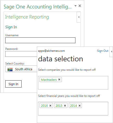
2. Open the Excel workbook and sign in with your Accounting login.
3. Select the Company and Financial Years you would like to report on
4. Open a new sheet (Shift + F11 or the plus icon next to your sheet name). Then in the Task Pane select Design My Own Reports. You should see the Operational tab.

5. From the Operational tab you can select the data you want to include:
- Operational area lets you choose the operational area you’d like to report on and determines what fields are available in the field selection below. I have selected Sales By Customer.
- Under information you would like to see you can select the fields you would like to use. I have included all fields.
- Use the start and end dates to select the range of data you would like to include. For example, 1 Jan 2015 to 31 Dec 2015. You can also leave the fields blank meaning that the entire range of data for the years you selected when you signed in will be used.
- Add a filter if you like by clicking the Add Filter button. I have created one that filters my customers. You can add multiple filters by clicking the Add Filter button again.

6. Click the Create New Table button. This will create a table in the Excel sheet based on the parameters you selected which you’ll use to build your report.

Let’s look at creating a PivotTable and Chart from the information in the table.
- Click on the table in Excel.
- Go to the Insert tab on the Excel ribbon, select PivotTable and then click OK on the Create PivotTable dialogue. A new sheet will be added with the PivotTable field list open.
- You can now easily design your report by selecting the required fields and placing them in the correct area:
- In the Rows area drag in Customer name.
- In the Values area add Invoice amount due.
- In your sheet you will see the PivotTable forming. Change the column titles Row Labels to Customers and Sum of Invoice Amount Due to Amount by typing in the cells.
- Change the number format to 2 decimal places and 1000 separator using the Format Cells dialogue. Access it by selecting the Amount column, right clicking on a value and clicking Format Cells.
- Sort the pivot table in descending order on Amount.
- Insert a heading for your report “Total Sales by Customer”.
- You can change the style of your table by selecting the Design tab on the PivotTable Tools ribbon.

4. From this you can now create a Chart to represent the data.
- Click on a cell in the PivotTable.
- In the PivotTable Tools ribbon, under the Analyze tab, select Pivot Chart.
- Insert a Pivot Chart of your choice, for example, a Column Chart.

You have successfully created a PivotTable and Pivot Chart report. You can repeat this process with other data from your original table and end up with a powerful KPI dashboard.

If you’d like to watch a video on this tip you can find it here.
