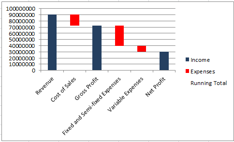
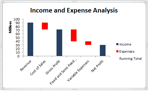
In last week’s tip, we shared a financial dashboard with you. In the dashboard, one of the charts that we used to present data was a waterfall chart. A waterfall chart is a special type of column chart used for understanding how an initial value is affected by a series of intermediate positive or negative values. Usually the initial and the final values are represented by whole columns, while the intermediate values are denoted by floating columns.
In this tip we show you how to actually create a waterfall chart.
Note: Download the Dashboard template to practice
Applies To: Microsoft® Excel® 2010 and 201
- We start by setting up the data. Select the Income and Expense Analysis worksheet.
Note:
The value in E5 (Running Total) is Revenue (G4) – Cost of Sales (F5).
The Running Total in E7 equals Gross Profit (G6)-Fixed and Semi-fixed Expense (F7).
The value in E8 is the Net Profit and equals Running Total (E7) – variable Expenses (F8).
- While holding down the Ctrl key, select cells B3:B9 and cells E3:G9.
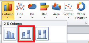
- Select the Insert tab.
- Select Column under the Charts group.
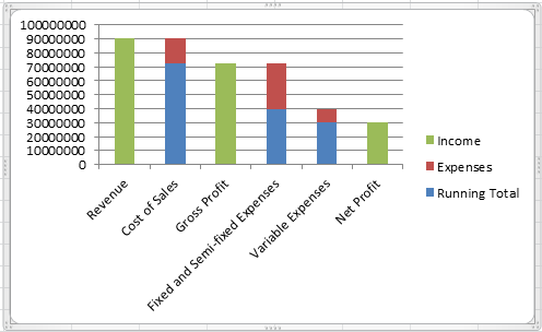
- Select the Stacked Column Chart.
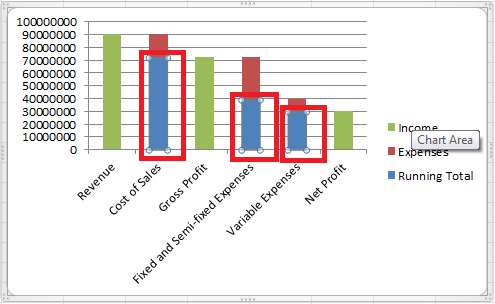
- Right click on the Running Totals series on the chart.
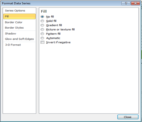
7. Select the Format Data Series menu item.
8. Select the Fill
9. Select the No fill radio button.
- Select the Border Colour
- Select the No line radio button.
- With the Format Data Series window still open, select the series on your chart that reflect Income.
- Select the Fill
- Select the Solid fill radio button.
- Select the colour that suits the theme of your dashboard.
- With the Format Data Series window still open, select the series on your chart that reflect Expenses.
- Select the Fill
- Select the Solid fill radio button.
- Select the Red
- Click the Close
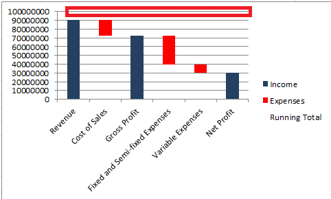
- Right click on one of the Horizontal Major Gridlines and select
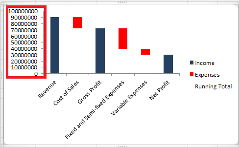
- Right click the Vertical Value Axis and select Format Axis.
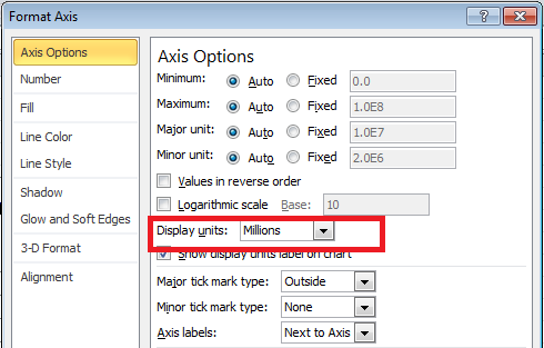
23. From the Axis Options menu, select the Display Units drop down.
24. Select Millions
- Select Close.
- Select the Waterfall Chart.
- Select the Layout tab then Chart title.
- Select above Chart.
- Enter Income and Expense Analysis.
The Revenue, Gross Profit and Net Profit are whole columns and show positive values. The Cost of Sales, Fixed and Semi Fixed expenses and Variable expenses show negative values and are depicted as floating columns.


