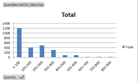
Never heard of a histogram? A histogram is a column chart that shows frequency data. For example, if you’re in sales and would like to analyze how frequently you sell certain quantities of goods, you can use a histogram.
Note: Download the workbook to practice this exercise
Applies To: Microsoft® Excel® 2010 and 2013
- Download the practice workbook.
- Select any cell within the PivotTable.
- Select the Options
- Click the PivotChart
- From the Insert Chart window, select the Clustered Column
- Click OK. The chart below will be inserted.
- Right click on one of the data bars in the chart.
- Select the Format Data Series menu item.
- From the Series Options items, change the Gap Width to 0%.
- The histogram below will be displayed. Edit the heading to “Frequency of Quantities Sold”.
As you can see with this example, customer often buy quantities between 1 and 100 of product x. Using this information a Sales Manager can perhaps focus on selling quantities in that range. You can apply a histogram to other types of data, try it out!


