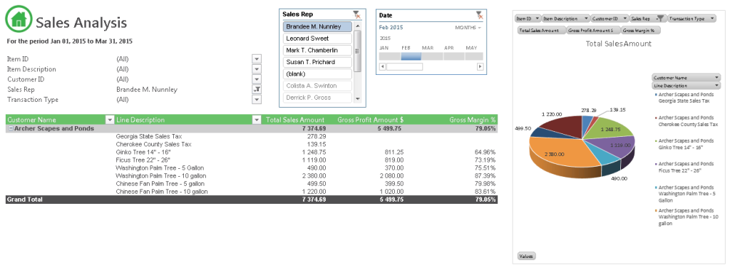
Ever wondered how you could effectively and more efficiently analyze your sales data without having to run through multiple reports and spreadsheets? The answer is simple – create a dynamic Sales Dashboard. With a dashboard created off the sales container in the Sage Intelligence Connector module, you can quickly view trends, sales dates, various customers, sales reps, gross profit, inventory statistics and more.
Here is a quick guide on how to create a simple but powerful Sales Dashboard. For this example we will use the Bellwether Garden Supply demo data in Sage 50 U.S. Note that the container name, report name, worksheet name and PivotTable fields may differ for your Accounting/ERP solution.
Step 1: Run your Sage Intelligence “Sales Analysis” report
- Open the Report Manager and run the Sales Analysis report for a desired time frame, for example, January through March 2015. The Sales Analysis report runs off the Sales Analysis container in the Connector. You could create your own new report to work off this container if you wished.
- Go to the Sales Analysis worksheet and click anywhere on the PivotTable – this is what we will be working with.
- Once the PivotTable has been selected, you can change its style and layout by clicking the DESIGN tab under PIVOTTABLE TOOLS on the ribbon.
- Also with the PivotTable selected, click on ANALYZE then Field List on the ribbon. The PivotTable Fields menu will appear on the right of the window and you can use it to remove any unwanted fields from the PivotTable.
- After formatting as desired, you can start using the powerful features of Excel to create your dashboard.
Step 2: Adding Slicers
PivotTables are very effective for crunching data but can be limited when using filters. This is because filters do not show you the current filter state when filtering on multiple items. This is where Slicers come in:
- Click anywhere on your PivotTable. From the ANALYZE tab, under the Filter group, choose Insert Slicer (you could also use the Slicer option under the Filters group on the INSERT tab).
- In this example we are going to create a slicer to report on different Sales Reps. Scroll down the list and check the box next to Sales Rep. Then click OK.
- A floating slicer now appears and you can place this anywhere on your sheet. Selecting a Sales Rep from the list will filter the PivotTable by that Sales Rep. You can select a range of Sales Reps by selecting the first one in the range, then holding the Shift key and selecting the last one in the range. You can also select a number of individual Reps by holding down the Ctrl key and selecting each individual. The Slicer has the advantage of showing which Sales Reps are being reported on at once. You can also add multiple Slicers to the sheet to filter multiple fields at once.
Step 3: Adding Timelines
Timelines report data based on dates and come in handy when analyzing changes in data over specific timeframes. Say you want to report on a specific Sales Rep’s sales for the month of January. You can use the Slicer and the Timeline to choose the Sales Rep and the month for a quick look at the sales, items and profit that they generated for that period. This saves time and eliminates the need for multiple reports.
- Click anywhere on the PivotTable. From the ANALYZE tab again (or the INSERT tab) and right next to the Insert Slicer option, click on Insert Timeline
- Timelines only report on dates. So in this case, let’s go ahead and check the Date box from the list that appears.
- A Timeline is now created for you to place anywhere on the sheet. You can move the slider to select date ranges. Go ahead and experiment with it. See how the data in the PivotTable pivots once more according to the selected date. You can also alternate between date views be it by months, days, years or quarters by using the drop down on the Timeline.
Step 4: Adding a Chart
Now to visually represent all this data and have it update with the PivotTable, let’s insert a PivotChart.
- Click anywhere on the PivotTable. From the ANALYZE tab again, select PivotChart
- A window pops up with some suggested charts. You can choose a chart that you think will best represent your data. Then click OK. In this case we are going to use a 3 dimensional Pie Chart.
- Once the chart has been created, move it to your desired location. Remember, this is a PivotChart and it will change along with the data in your PivotTable. You can go ahead and format the chart’s colors, headings, axis labels, etc.
And that’s it! You have successfully created a simple but very effective Sales Dashboard that lets you report on all sales data, over various time frames with visual representation. With this dashboard, and a few clicks, you can answer questions like: What were the total sales by rep Brandee M. Nunnley for the first 14 days of January? Who were all the customers she sold to? What inventory items did she sell? And the quantities sold?
In our next tip we will provide you with a comprehensive example of how to use the ZeroingII add-in in the Report Manager to hide zero balances in your reports.


